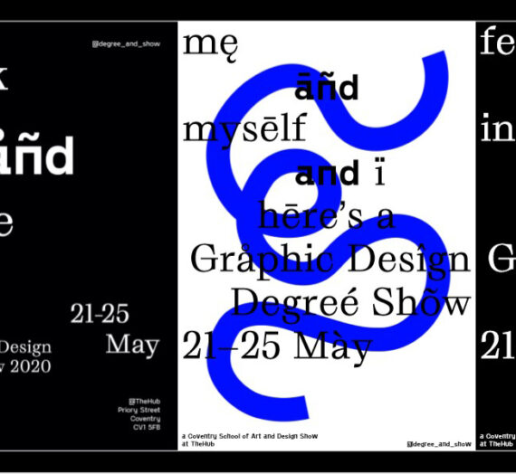
In our typography lesson this week, we were developing our skills in picking up characteristics of typefaces. This would come in useful with our current project, in which we are developing a font. This font has been inspired by a sketch we previously created.
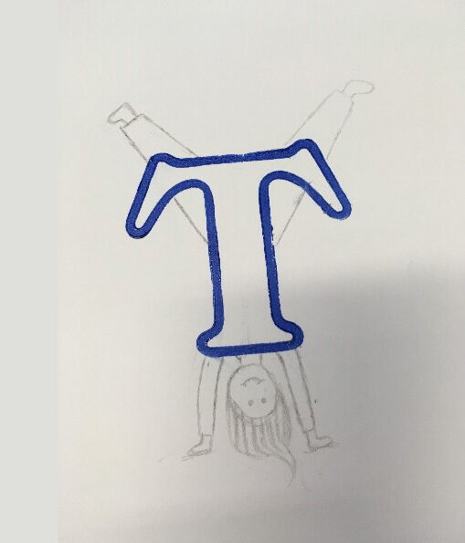
We picked a letter from the letter press set and printed it. We then assessed what we thought the character behind the letter would be like. We had to consider whether the letter was bold or heavy, which may represent a confident character. Or was our letter delicate and thin, which may represent a classy personality. I chose the letter ‘t’ as you can see from above.
My interpretation of the letter was that it had a free, energetic character. This is due to its rounded shape, with no sharp corners and no sharp edges, making me feel as though the letter wasn’t very structured or strict. Also, as it wasn’t bold and was only made up of an outline, I felt as though it was a happy and transparent person.
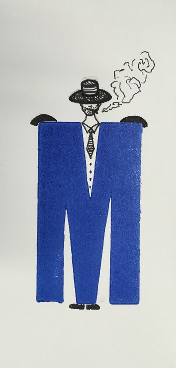
I found this task interesting as it seem bizarre how you can depict an actual person from a letter form but its very much true. It shows how much information you can receive through a typeface and how important it is that a typefaces fits its purpose and communicates the meaning which you want.