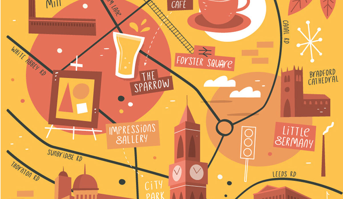
While researching for inspiration on for my Spon Spun map design I came across Tom Wooley’s work. He is a freelance illustrator who specialises in illustrated maps, 3D diagrams and vector artwork.
I was interested by his work as there more unique than as standard map and are much more creative and artistic. Each map portrays the city or area he is designing in a positive fun way which makes it appealing for the viewer. His info designs tend to not have legends which I don’t think is needed as its all explained clearly through the map illustrations as well as the text on the maps themselves.
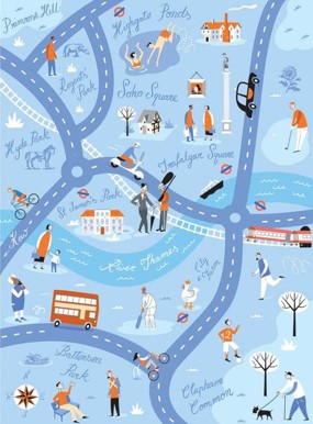
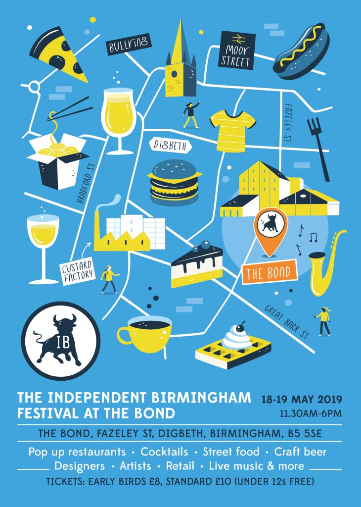
This maps of London is communicated strongly through the British colours used here. Again in a hand drawn style which has caught my eye as it gives the viewer the information in a more fun way. It’s reflects London’s busy atmosphere well using the characters positioned all around the area.
One things I’m unsure about his designs are how accurate the roads and locations are in the relation to the real cities. His designs seem more loose when it comes to the accuracy of the streets which could be an issue if someone is using it for navigation. My map must be more accurate to respond to the brief.
I would like to use fun cartoon like illustrations on my map like Tom, to make it more visually interesting. Also easy to understand as the festival does have international visitors taking part, which may struggle with English.