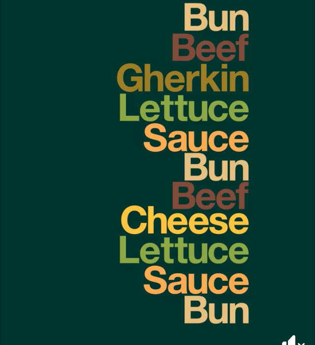
While scrolling through my social medias recently I came across this advertisement which caught my attention. It’s a McDonalds campaign image to advertise one of their burgers.
I found this interesting as they’ve purely used typography without any images. As we had been focusing on using type as image in our poster designs in our 114aad lessons I thought this was an interesting way of visualising the burger without seeing it. I think its clever instead how they’ve used the colours of the different layers to mimic the ingredient as well as how they’ve stacked up the words to take the shape of the burger itself. For something so simple and easy to create I think its effective and made me stop and look at it.
I think its unique and less boring than just showing a photo of the food itself which has been done so many times before. It also portrays the message that the burger is so iconic already that it no longer needs an image for people to recognise it.