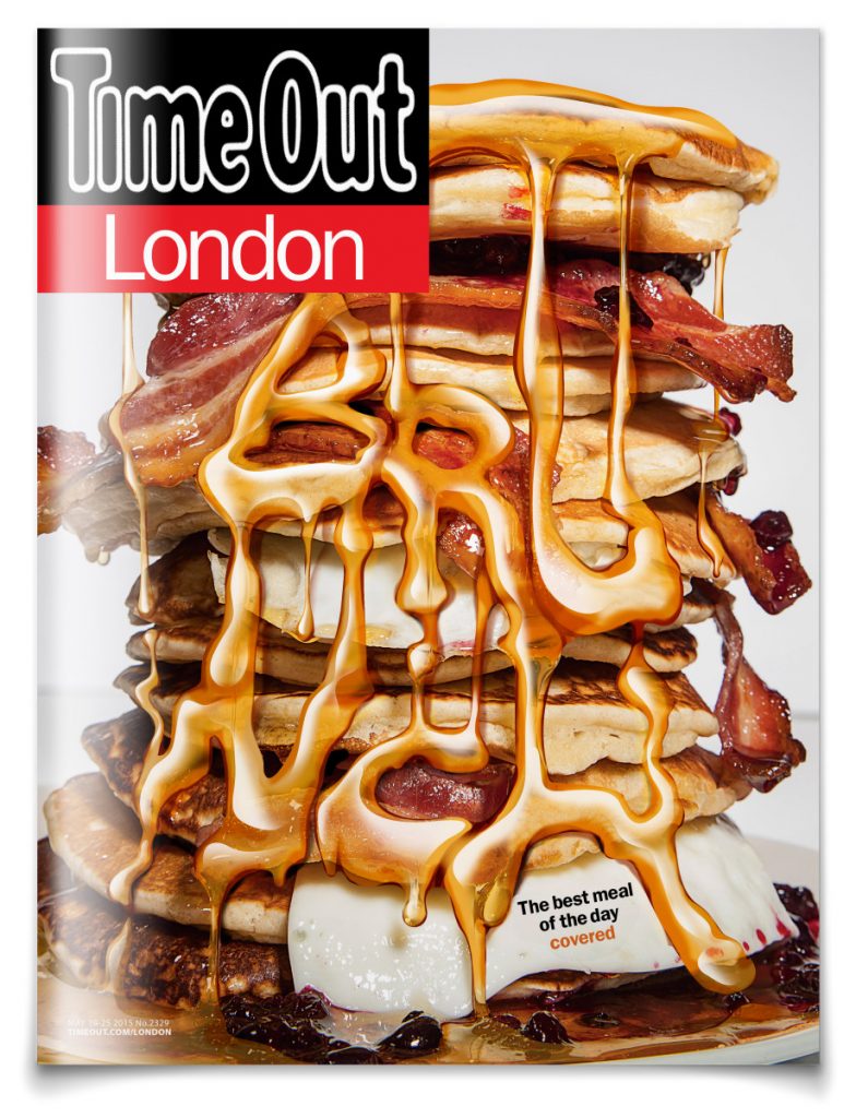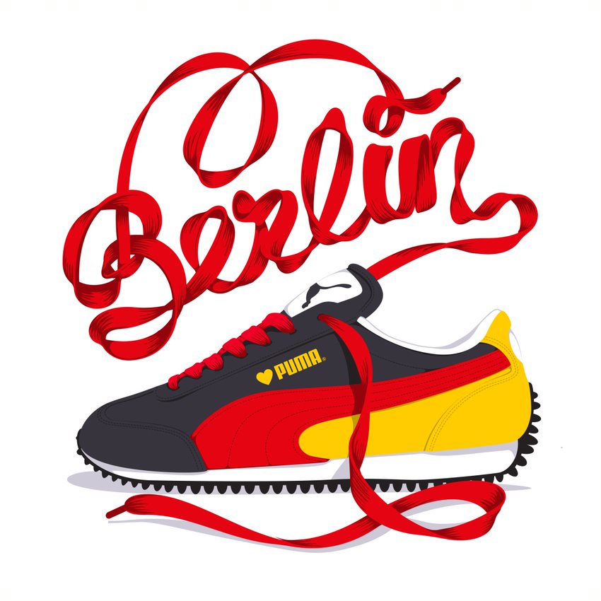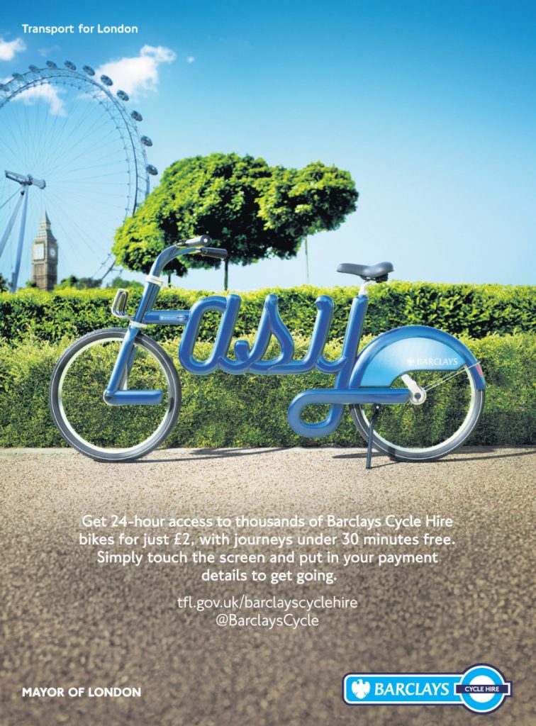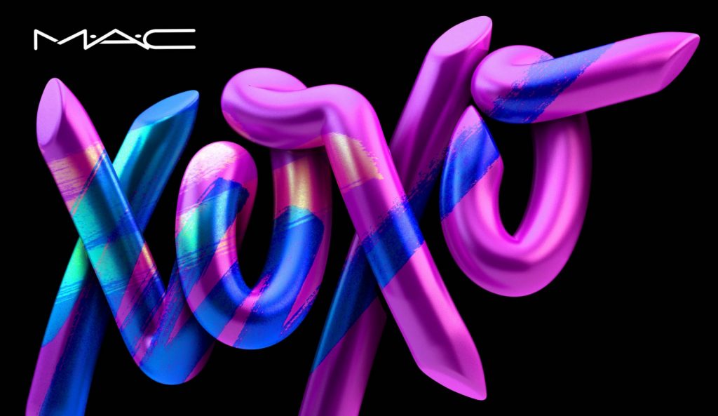
Alex Trochut is a graphic designer from Barcelona who combines illustration and typography to challenge the rational side of thinking and creating work. I really admire his style of work as his use of type is fluid and expressive. He’s influence to me during some of my projects due to his use of type as image.
I find his design strategy and how he approaches a project particularly interesting.
“For Alex, typography functions on two hierarchical levels. First, there is the image of the word we see; reading comes secondary. As a designer, Alex focuses on the potential of language as a visual medium, pushing language to its limits so that seeing and reading become the same action and text and image become one unified expression.” – quote from the Alex Trochut website.
Other designers would believe legibility was crucial in the making of a poster campaign. I think this makes his work a lot more intriguing and although it may not read as clearly as others it makes you want to examine the design in more detail and therefore captures your attention for longer.
In agreement with me are lots of brands who have commissioned Alex to produce work for them.
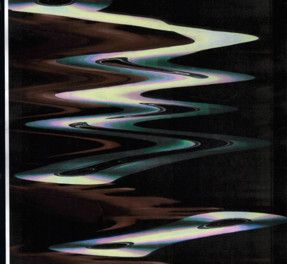
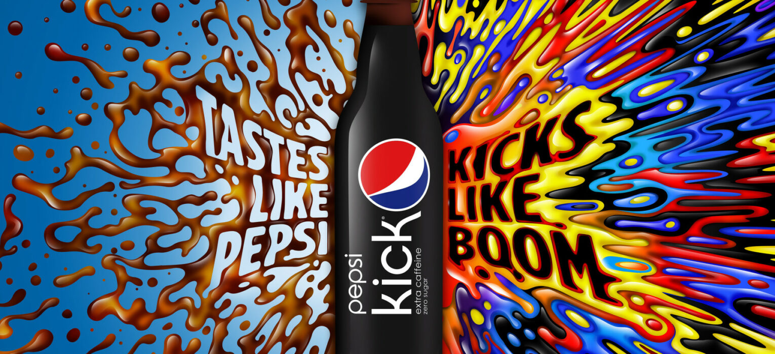
Here are some of my favourites,