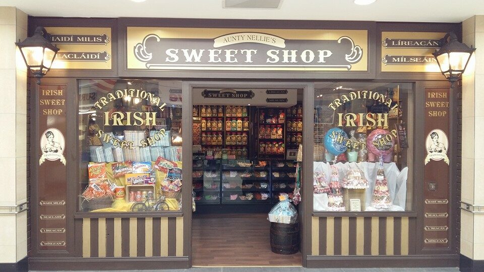
I found myself beginning to struggle with expanding the visual language of my exhibition campaign and showing my overall concept in all aspects of my designs. So I decided to do more research, following my theme of confectionary.
I decided to branch off from this and research sweet shops, specifically old fashioned ones to see there use of colour, typography etc.
Here’s what I found;
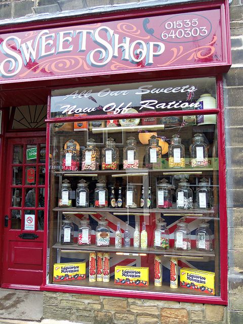
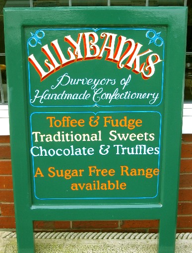
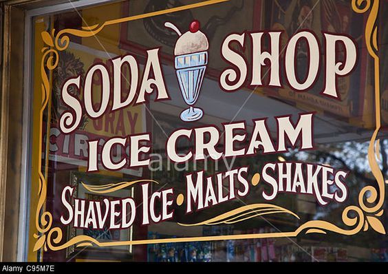
I noticed that they use fancy borders around there signs which I may try and implement into my own work maybe around the titles.
The typography is always very swirly and uses serifs.
I explored similar fonts and here’s the ones I’m considering incorporating into my leaflet and other aspects of my campaign as I think it will create nostalgia of traditional sweet shops so will be easily recognisable.
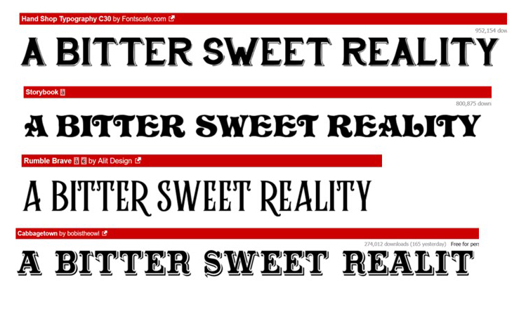
Photo sources:
https://i.pinimg.com/originals/eb/d0/e4/ebd0e465cfa42eefded4ad28955ab0e5.jpg
https://www.pinterest.co.uk/pin/365002744791489311/
http://www.artbysylvia.co.uk/sf-sw-lily-victorian_sweet_shop.htm