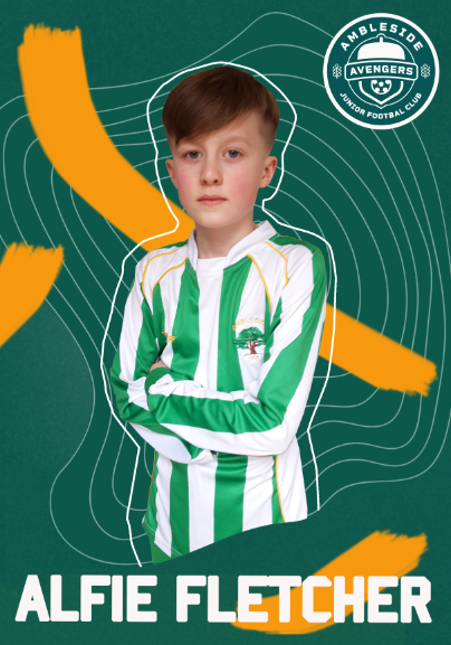
The Spiekerman team now have an established concept for the Ambleside Avengers, based on our reimagined logo design. As we are now in the position where we have a visual identity and we can start to experiment with this across all touchpoints required on the brief. As a team we came to an agreement about who would work on each deliverable. My role is to work on the poster designs, here is my poster at different stages of development from initial ideas to completion.
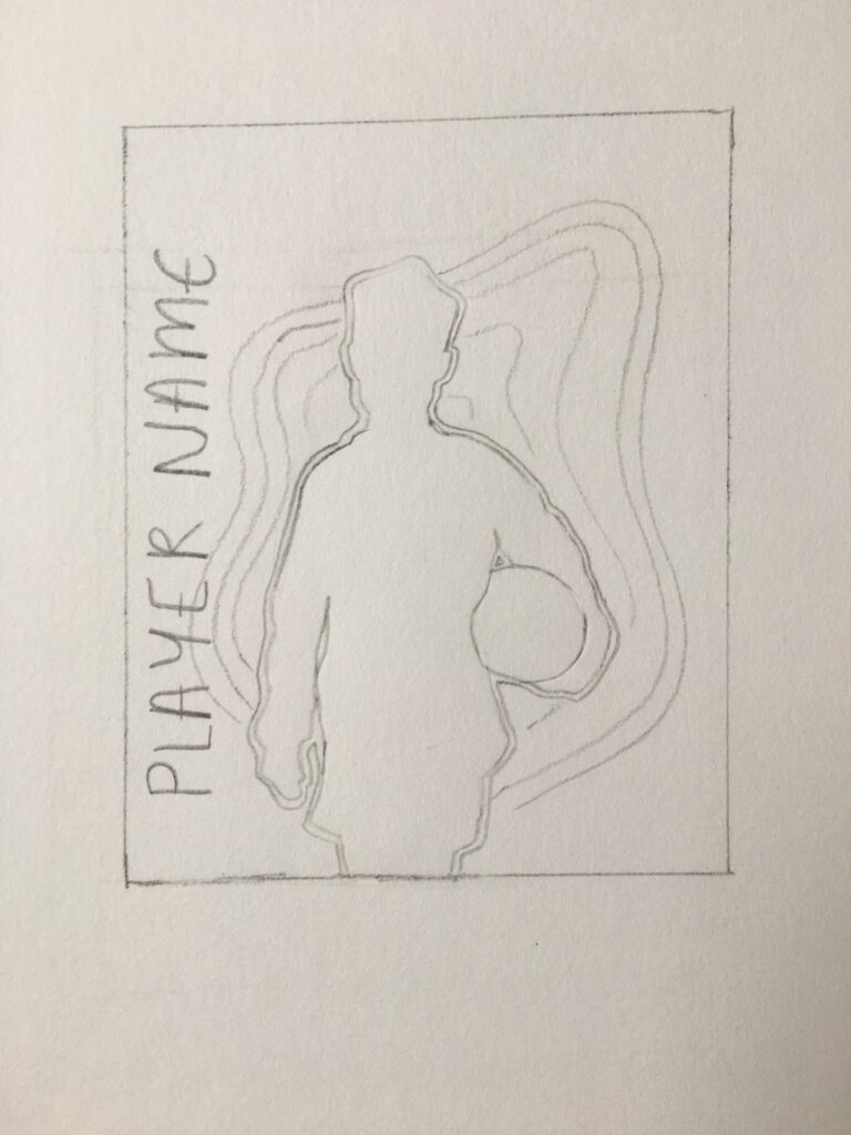
Here are my initial sketches and digitalised rough ideas to show to the team.
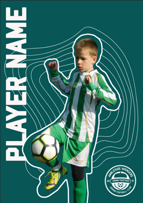
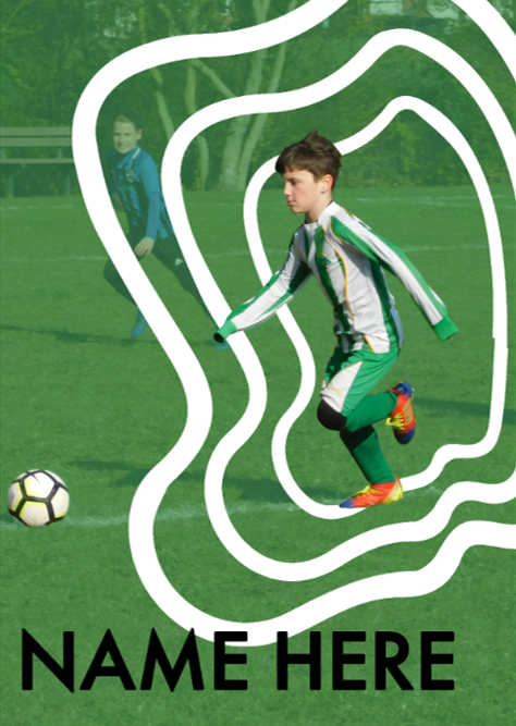
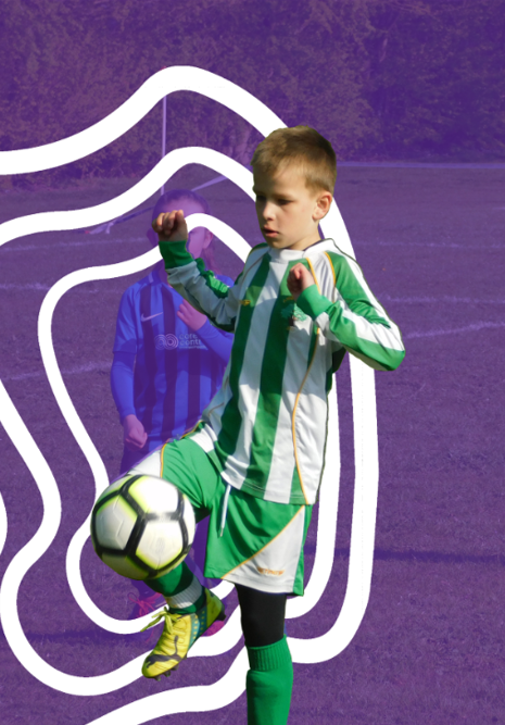
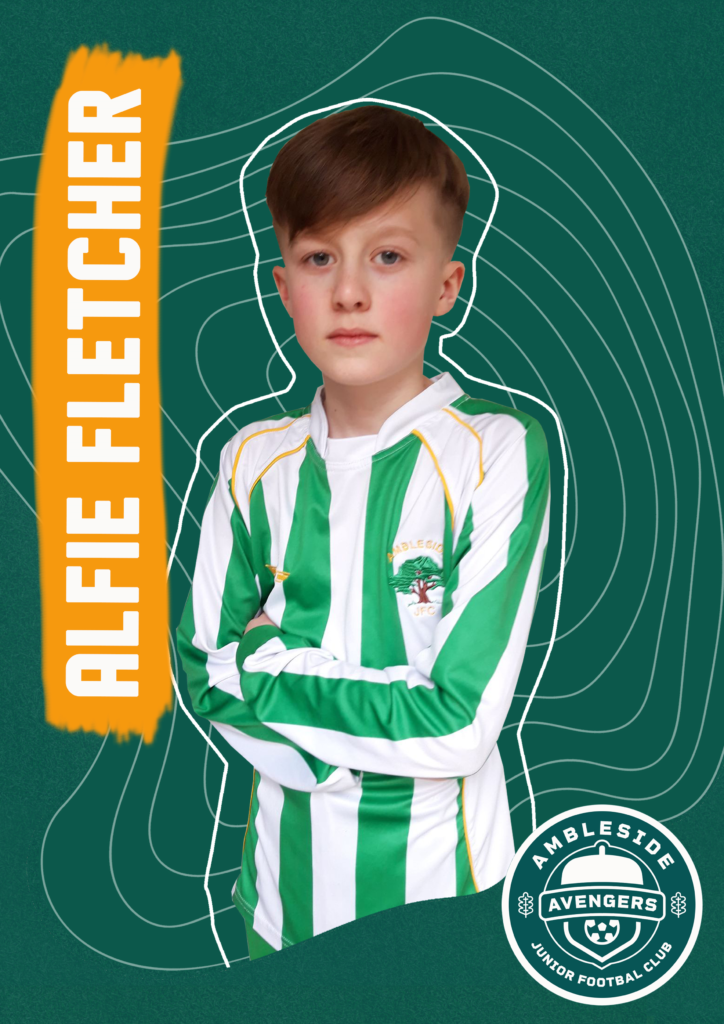
These were possible poster compositions once we’d established a colour palette.
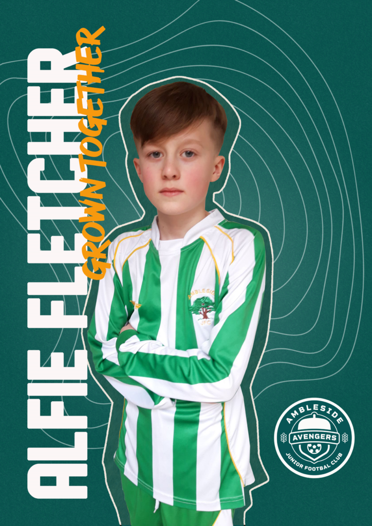
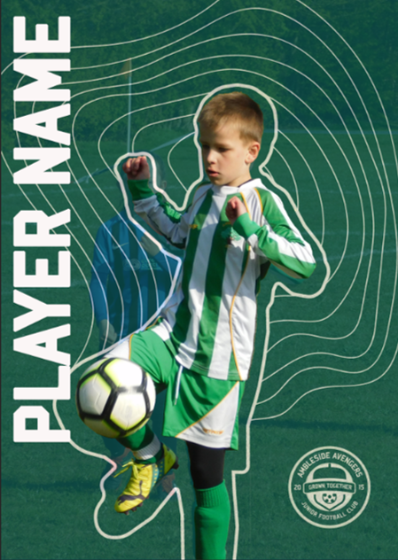
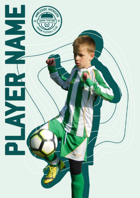
These designs show further improvements when we decided to change our typeface and also incorporated a secondary typeface to make it more playful.
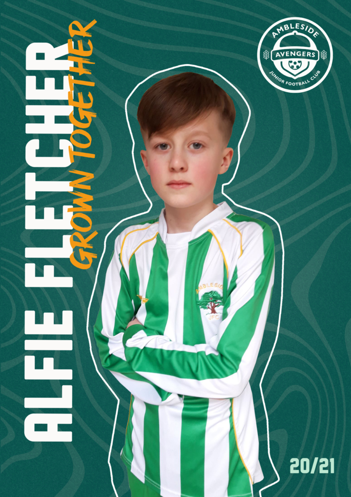
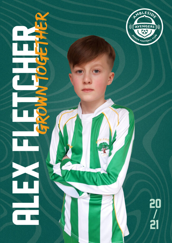
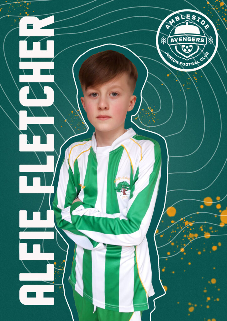
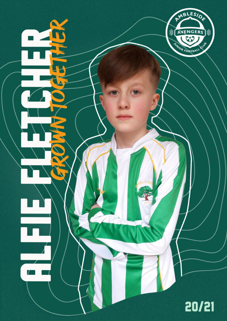
At this stage we decided to make our tree age lines more dynamic. After feedback from the lecturers I also removed the outline of the player, aswell as changing the layout of the season date to match the playing cards.