Our team had a 5 minute presentation, in which we showed the lecturers and our peers our progress on the Ambleside Avengers extended project.
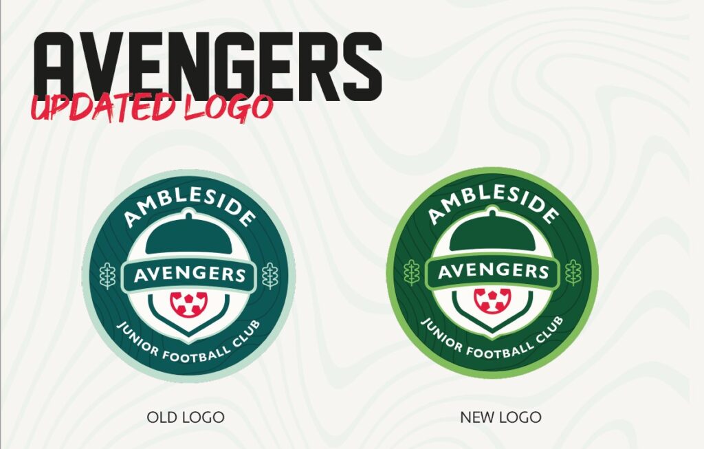
We presented our new logo based on the requests of the client to make the colour scheme more green.
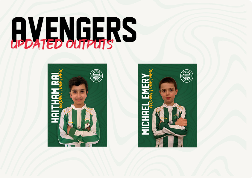
We also showed what the posters looked like with the new colours applied. We received feedback on improvements I could make to them. The lecturers commented that there was a lot of empty space on the poster, which they thought could be improved by making the image of the player bigger. I will now take there feedback onboard and improve the posters, although I’m not sure how it will work in terms of flooding into the path of the typography.
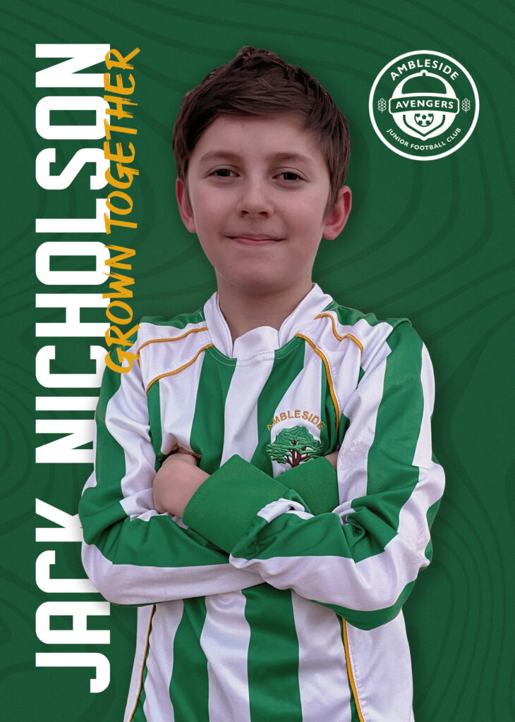
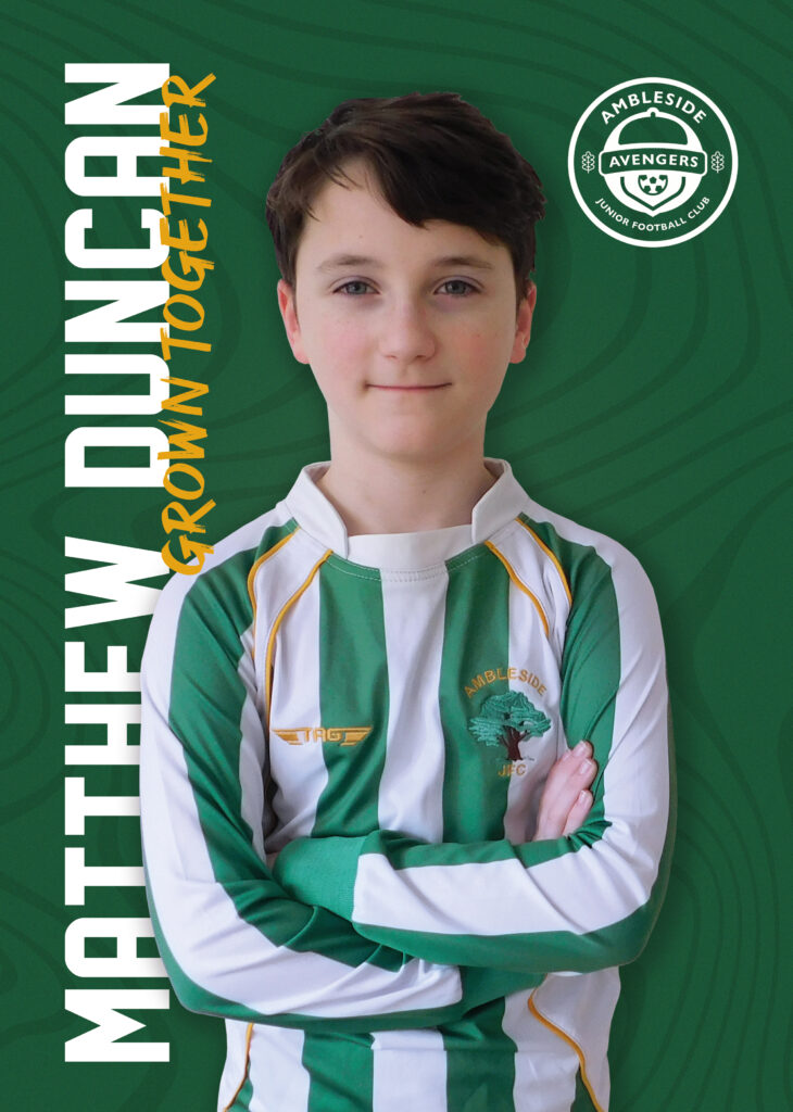
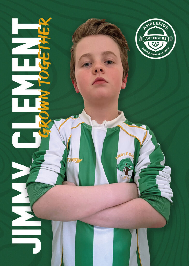
These are the poster after I made the improvements suggested to me by the lecturers, I think it would a lot better now I’ve increased the size of the player to fill the composition.