After our last team meeting we decided we would individually pick a section of the booklet to design and experiment with different layouts which follow our brand identity and guidelines . We would then have lots of variety which we could develop as a group and analyse what works best. As we don’t yet have text given to us by the client we are working with placeholder text.
Here are my initial designs;
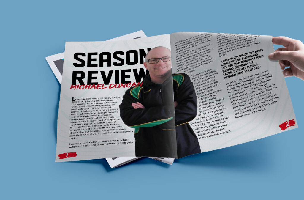
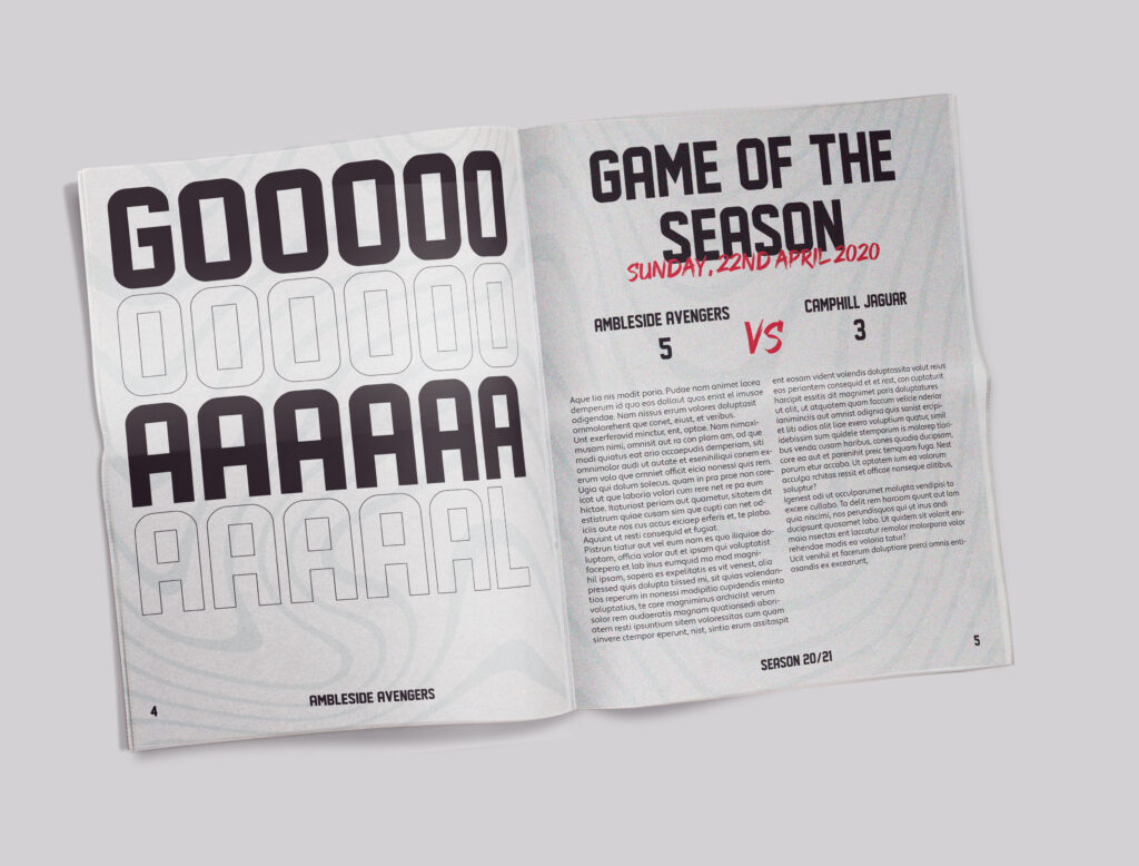
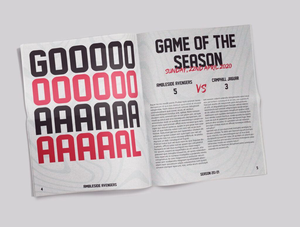
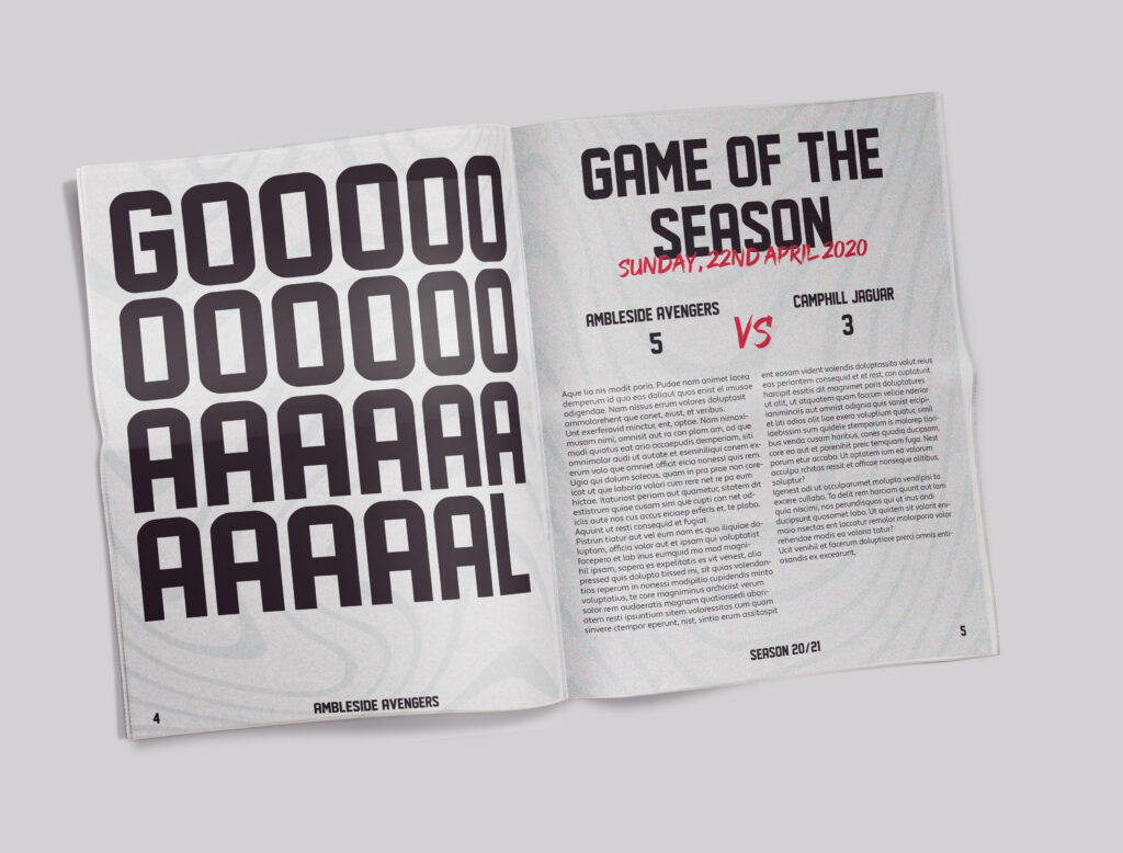
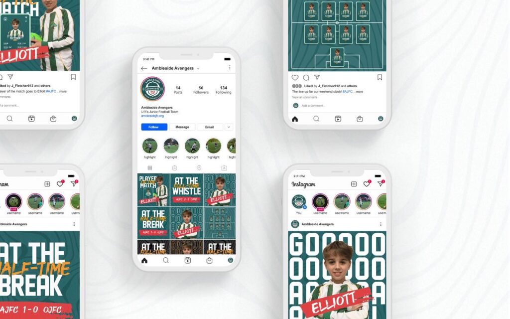
I decided to use expressive type and brush stroke visuals which features heavily on our existing social media.
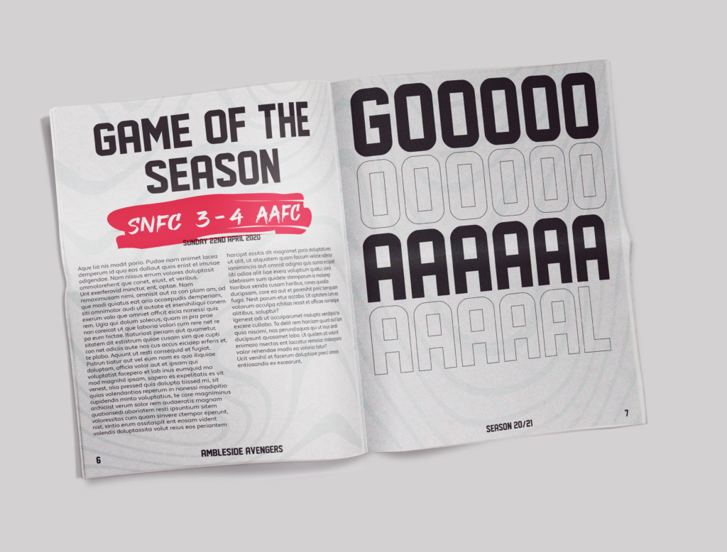
Updated 23/03/21: During a tutorial the lecturers feedback suggested they liked these designs and the bold ‘GOAL’ title as it reflected the celebration aspect of wining a game. Although they thought the legibility of the second and bottom row was compromised as it doesn’t have a fill colour. They thought I could improve this by adding another colour to those lines.
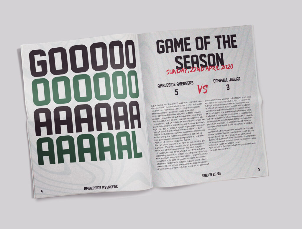
Here are my improved designs based on there feedback;