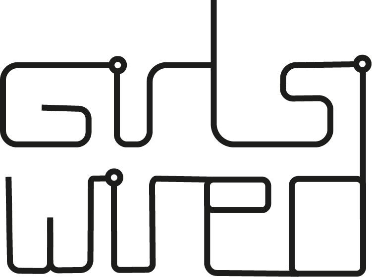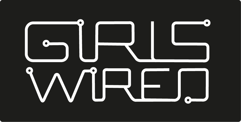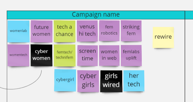
As a team we had been working on developing our campaign identity. Influenced by our research, we brainstormed name ideas during various team zoom meetings. We had decided on the name. ‘Girls Wired’ which works on multiple levels as it represents the wires often used in the field of technology as well as the idea of girls connecting and coming together to change the technology industry.
We each created our own logo designs based off this name. Here were my initial thoughts.
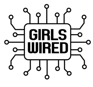
1 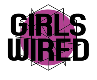
2 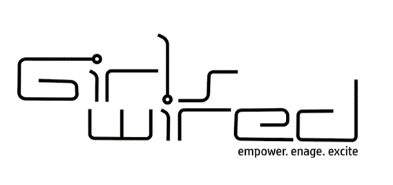
3
We brought these designs back together to evaluate which ones we liked. We also were able to get feedback from our lecturers and client, in regards to what they thought worked best. Both of them said they liked my 3rd design, but thought we could try and push the concept of wires further and try to conjoin all the letters as if to be a circuit.
These are my new designs based on the feedback we received doing the previous tutorial.
We then showed the improved designs to Mark. His response to the updated logo designs was extremely positive and he believed it didn’t effect the legibility like we initially doubted. He thought we could also apply some colour to an element of the logo such as just on the first line.
