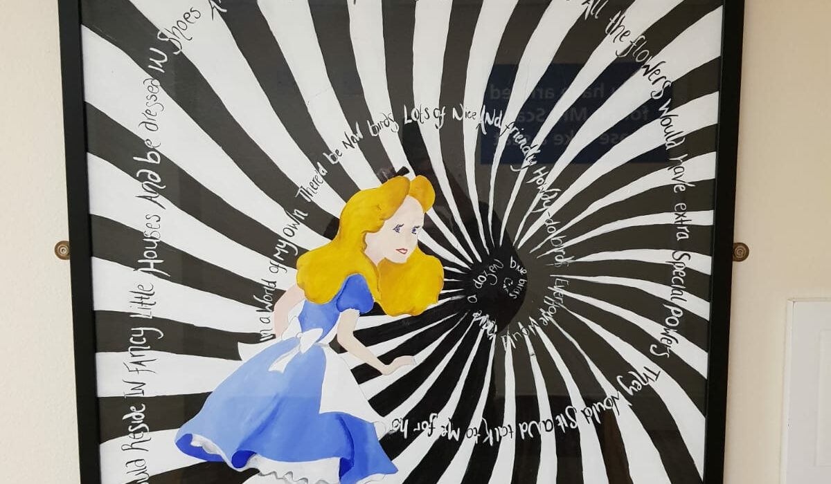
This is a piece of artwork I took a photo of while I was in the waiting area of a hospital.
It caught my attention as it related to me as its based on Alice in Wonderland a well known folktale which was easily recognisable through this artwork design. I took this into class for Tuesdays lesson as we were discussing poster designs. Although this is more of a painting than a poster I felt it had some similar traits. Such as use of typography, imagery etc. I like how the typography follows the path of the imagery and creates difficulty to read which I think is a good reflection on the image story as it creates confusion. I think they’ve used the golden ration, whether this has been done purposely or not, it does draw your eyes in to the centre of the image. I also like how the basic colours of the background make the colour of Alice herself stand out more and make her the focal point.
This image did catch my eye while I was sat in the waiting room so I feel it has succeeded it purpose to maybe distract the viewer who may be nervous and have a lot on there mind and make the area seem more inviting.