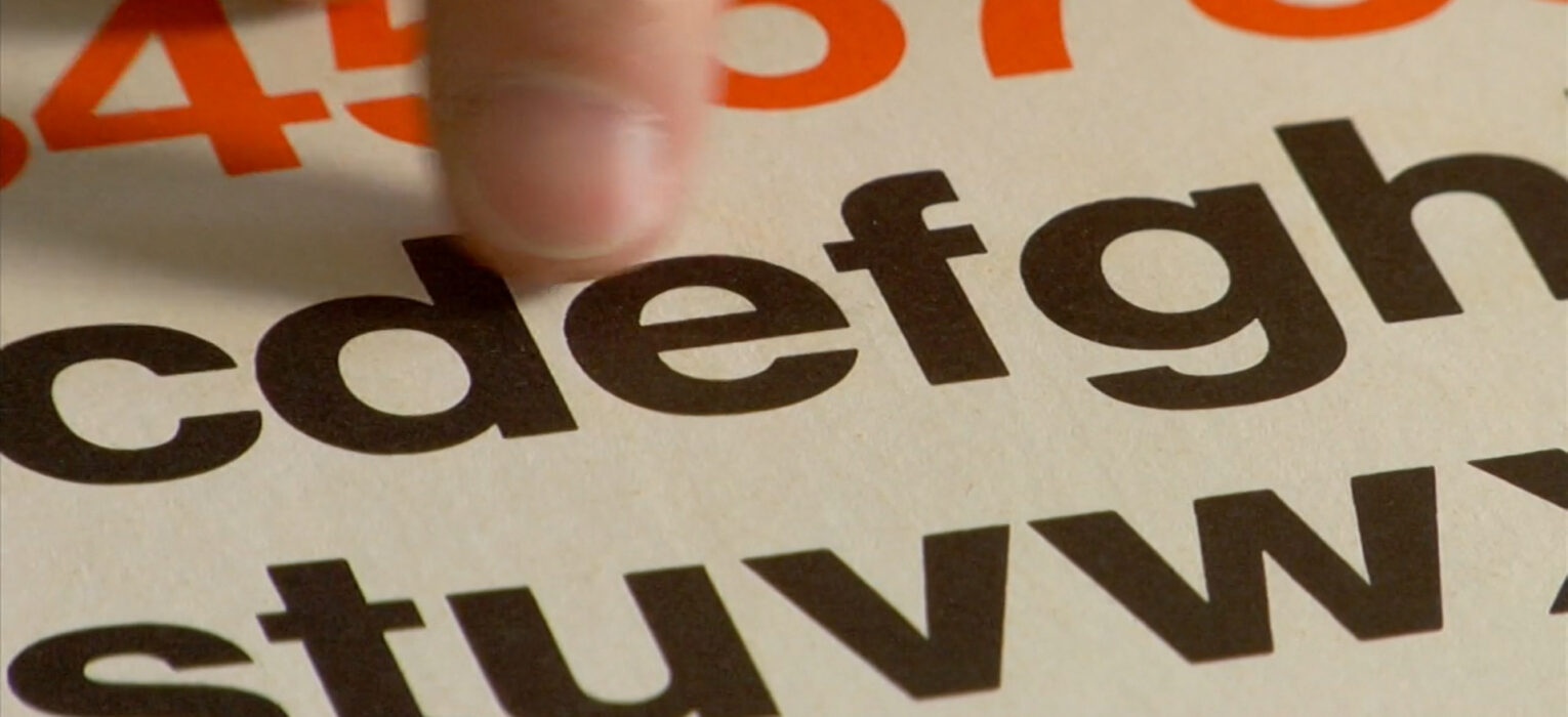
Due to the global COVID crisis Filmmaker Gary Hustwit is streaming his documentaries free worldwide. This weeks film is ‘Helvetica’ which I watched today. The documentary discussed the iconic font as well as typography and visual communication as a whole.
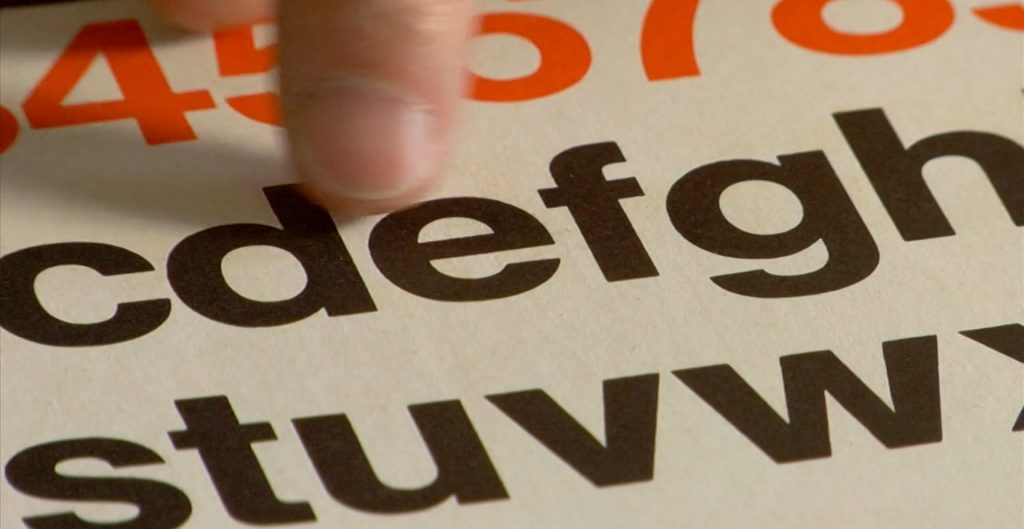
Helvetica is one of the most widely available and used fonts ever. The documentary discussed peoples views on Helvetica and what it meant to design at different periods of time.
So what makes Helvetica the ultimate typeface?
Throughout the documentary Helvetica was described as clear and legible with the ability to be applied to all context.
It is and has been used by many companies and corporations because it makes them seem neutral and efficient. The smoothness of the letters implies cleaness seeming more accessible, transparent and official.
Its thought that its modern almost machine like quality makes it a neutral typeface which allows you to express your message through the content rather than the font itself.
Its easy to use as it open for interpretation.
A quote I picked up which is in favour of Helvetica is that “You shouldn’t be aware of the typeface at all”
But is that really the case?
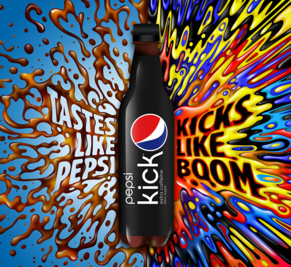
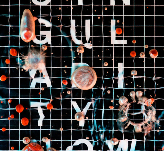
I feel as though there are situation in more expressive typography when its good for the type itself to have a meaning so it has the ability to create a mood and atmosphere no matter what words the type says, such as our current design practice project, the typography being the main form of communication in the poster.
Source of information: https://www.ohyouprettythings.com/free
