After everyone designed some visuals for our degree show concept, we picked out elements of everyone’s which we liked and combined them. We really liked Yasmin’s style of illustration so used this as the basis for our designs. We also defined our typeface and colour palette to create consistency across our outputs. We decided to go for a bright fun colour palette which would ensure we stand out and be relatable to the fruit juice idea.
We shared all of our assets on a shared one drive so we were all able to access the elements we each needed.
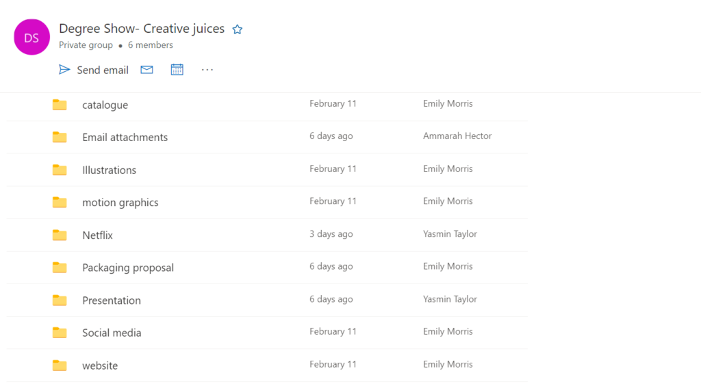
As a group we then decided who would create each deliverable we had been instructed to create to see how the concept would work across a catalogue, website, social media and motion graphics. As well as overseeing the other elements of the degree show designs, I was given the task of creating the motion graphics which could be applied across the website and social media.
Below are my designs which use our brand visuals. I wanted to create a flowing movement to the juice reinforce our concept.